Booki: Be The House
A case study in designing, building, and shipping a full-stack sports betting platform as a solo product designer.
visit bookisports.com →jump to interactive prototype ↓
The House Always...
Prediction markets are booming and sports betting is mainstream, and every friend group already has a little action on the game. The natural next question: why not run the book yourself?
But the tools that exist today weren't built for you. Pay-per-head platforms are archaic, clunky, and designed for offshore operations, not someone organizing picks for ten friends. They charge $5-10 per player per week, which means even a small 20-person group is burning $400-800/month. There was nothing modern, nothing affordable at small scale, nothing that looked like it belonged on your phone in 2026.
I saw a gap: a trust-first platform for private sports betting groups: simple to set up, beautiful to use, and priced as flat-fee SaaS instead of per-head extraction.
My Role
Everything. Product strategy, UX research, interaction design, visual design, design system, frontend engineering (SwiftUI + web), backend architecture (Supabase Edge Functions, PostgreSQL), marketing site, SEO, content, and go-to-market.
Stack: iOS (Swift 6 / SwiftUI / SwiftData), Web (Alpine.js SPA), Backend (Supabase / PostgreSQL / Deno Edge Functions), Payments (Stripe + Apple IAP), Email (Resend).
Strategic Framing
Two-Sided Product, One Interface
Booki serves two users with fundamentally different mental models:
- Organizers think in risk, exposure, and settlement cycles. Their job is managing a group.
- Members think in odds, picks, and balances. Their job is placing bets and knowing where they stand.
Rather than building two separate apps, I designed a single product with role-gated experiences: shared data model, divergent UIs. This kept the codebase manageable while letting each side feel purpose-built.
Trust as Core Product Value
In betting, disputes are inevitable. The #1 feature isn't odds or grading; it's proof. Every design decision laddered up to a trust thesis:
- Tamper-evident ledger — financial entries are hash-chained, making retroactive edits cryptographically detectable. This isn't just backend architecture; it's a product differentiator I surface in marketing copy.
- Server-authoritative operations — all critical actions (submitting, grading, settling) execute on the server with idempotency protection. The client can't fabricate results.
- Full audit trail — every bet, grade, settlement, and balance adjustment is logged with timestamps and actor IDs. Both sides can verify history.
This wasn't over-engineering. It was the insight that in a trust-deficit domain, the product is the audit trail.
Mobile-First as Strategy
The thesis: meet the user where they already are: their phone, mid-game, on the couch with friends.
The younger demographic I was targeting doesn't sit at a desktop to manage bets. They're texting odds in group chats, checking scores between plays, settling up over Venmo. An iOS app wasn't just a platform choice; it was a UX bet that the entire experience needed to feel as fast and casual as sending a text.
That conviction shaped everything downstream:
- Offline-first architecture — SwiftData stores everything locally so the app feels instant. No loading spinners between screens. This matters when someone is placing a pick 30 seconds before tip-off.
- Auto-pilot as the default — a younger casual group doesn't want to manually approve every bet. The system should just work. This was a product decision that only makes sense when you're designing for the low-attention, high-frequency use case of a phone.
- The eventual pivot — after building the full native experience, I discovered the download was the biggest friction point. The web-first repositioning didn't invalidate the iOS strategy; it validated that the UX patterns I prototyped natively (bet slip persistence, sport tab browsing, quick-pick odds buttons) were the right interactions. I just needed to remove the App Store gate before people could experience them.
The iOS app was the proving ground. The web dashboard was the distribution play. The design language traveled between both because it was built from a system, not a platform.
Design System
I built a comprehensive design system from scratch, documented in a dedicated spec and implemented in a centralized Theme.swift file with reusable SwiftUI view modifiers. The governing philosophy: remove elements until the design breaks, then add back one thing.
Color
Dark-first with a sports-broadcast aesthetic. Electric cyan (#00F5D4) is the signature accent for actions and wins. Semantic colors are strict: cyan for wins, coral red for losses, warm orange for pending, never decorative. Gradients (cyan-to-purple) are reserved for primary CTA buttons only.
| Token | Value | Purpose |
|---|---|---|
| Accent | #00F5D4 | Actions, wins, focus states |
| Secondary | #9D4EDD | Gradients, secondary emphasis |
| Danger | #FF6B6B | Losses, errors, destructive |
| Warning | #FFA94D | Pending, attention needed |
| Background | #0A0A12 | App base |
| Card | #14141F | Elevated surfaces |
Typography & Numbers
SF Pro system font, three weights max per screen. Monospaced digits (.monospacedDigit()) everywhere; currency, odds, and scores align cleanly. Type scale runs from 34pt display (hero numbers) down to 11pt micro (chip labels).
Spacing, Radius & Motion
4pt base grid with values from 4pt to 48pt. Generous corner radii (12-16pt) for a softer feel than traditional betting UIs. Elevation through color, not shadow: featured cards get a subtle accent glow at 15% opacity instead of drop shadows. Motion uses critically damped springs (0.7-0.8 damping), all honoring prefers-reduced-motion.
Components
Standardized as reusable view modifiers: .cardStyle(), .elevatedCardStyle(), .glowingBorder(), .gradientText(). Every card, button, input, badge, and list row pulls from the same token set, consistent across 67 views without any one-off styling.
Key Design Decisions
1. Auto-Pilot as Default
Most betting platforms start with manual controls and let users automate later. I inverted this.
New organizers get a fully automated system: bets auto-accept, games auto-grade when final scores come in, settlements auto-calculate. Manual approval and manual grading are opt-in toggles buried in settings.
Why: The target user isn't a professional bookie; they're someone organizing bets for friends. They don't want to manually approve every bet. The first experience should feel effortless, with power controls available when needed.
This single decision shaped the entire backend architecture. Auto-grading required sport-aware logic (moneyline, spread, totals each grade differently). Auto-settlement required atomic database transactions. Live score polling required smart API call budgeting.
2. Standalone-First Onboarding
Early versions required users to choose "Organizer" or "Member" at signup. Conversion data showed this fork paralyzed new users who just wanted to explore.
I redesigned onboarding to drop everyone into a standalone player experience with a synthetic $10K credit line and 25 open bet limit. No group needed. Just browse games, place picks, and see how it works.
The "Become an Organizer" upsell lives in the Account menu: one tap creates a bookie record, and the UI transforms. The upgrade path follows exploration, not precedes it.
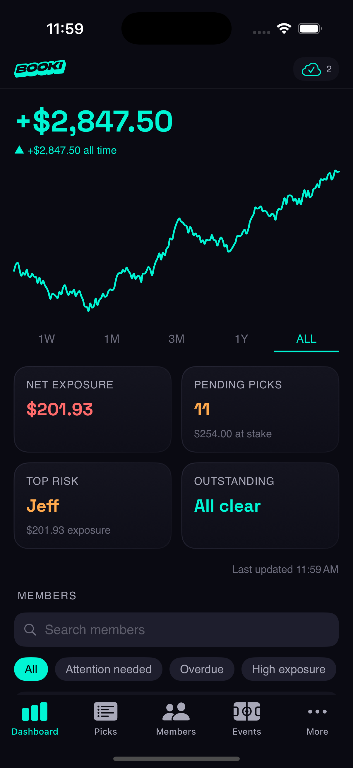
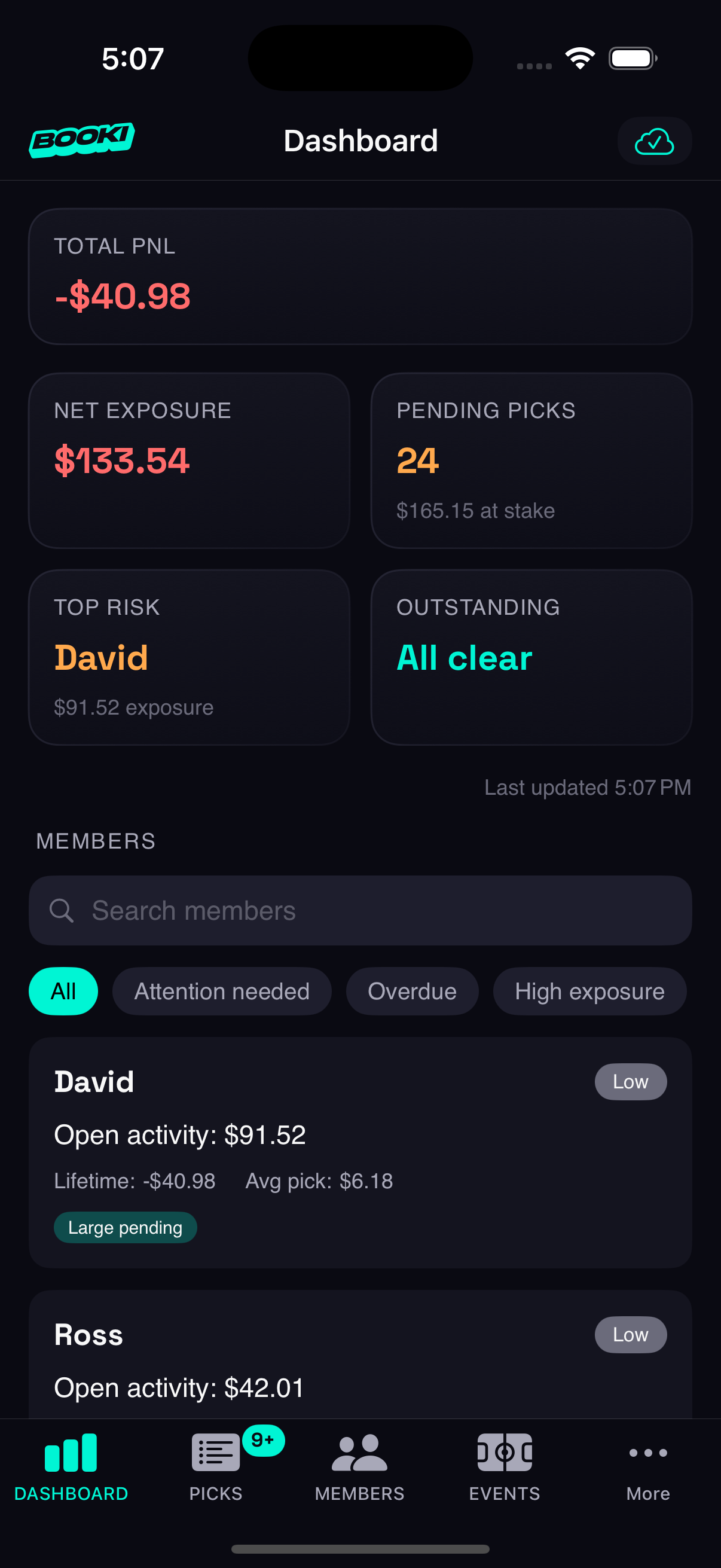
3. Attention Tags for Organizer Intelligence
Organizer dashboards in competing products show raw numbers. I designed an attention tag system that translates data into actionable signals:
- Picks Pending — bets awaiting manual approval
- Overdue — balance outstanding past threshold
- On Heater / Cold Streak — recent win/loss patterns
- Whale — disproportionately large stakes
- Parlay Demon — heavy multi-pick activity
Tags are tappable with explainer modals so organizers understand why a member is flagged. The Members list is filterable by tag, turning a flat list into a prioritized action queue.
4. Bidirectional Stake Entry
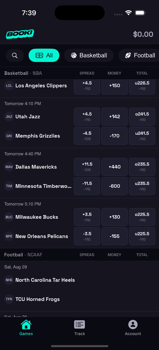
Placing a bet involves two mental models: "I want to risk $50" and "I want to win $100." Most platforms pick one. I designed a bidirectional input where both fields are live-editable: entering a stake calculates the potential return, and entering a desired return back-calculates the required stake.
The challenge was preventing feedback loops. Both fields update each other in real-time, so without careful state management, editing one triggers a write to the other, which triggers a write back. I built a focus tracking system that knows which field the user is actively typing in and only calculates in one direction at a time. A custom numeric keypad keeps the bet slip compact; the system keyboard would eat half the screen and push the slip out of view.
5. Two-Sided Data Perspective
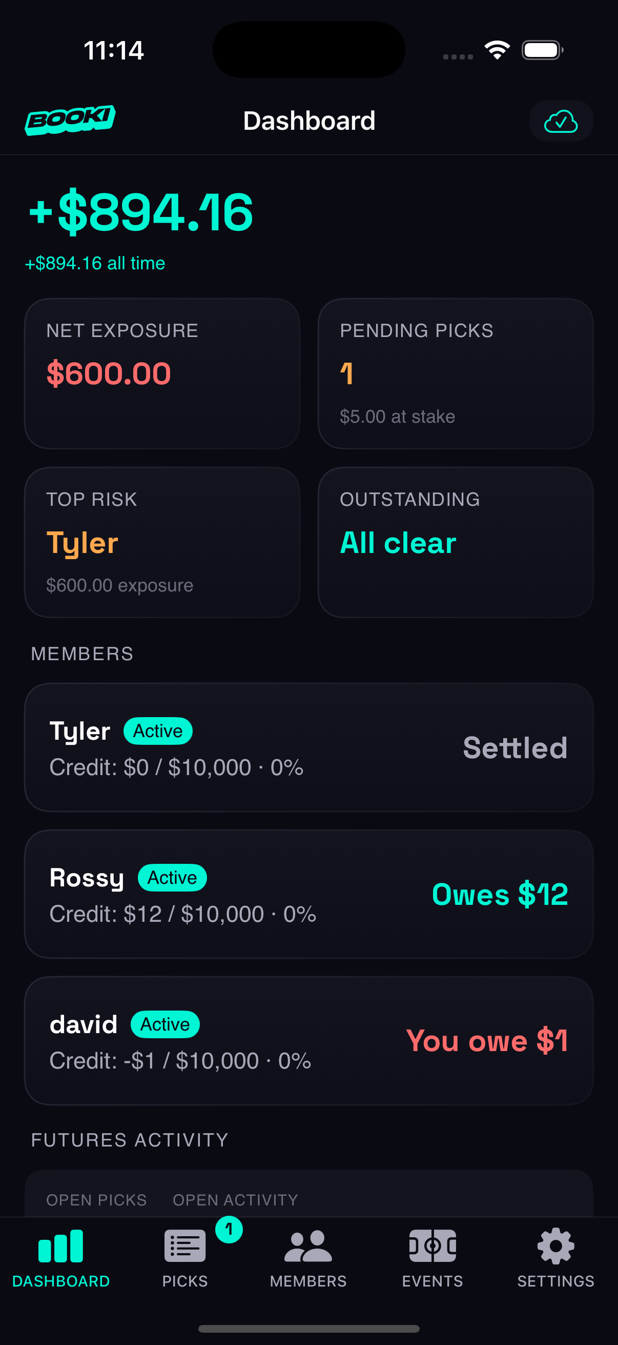
The same bet, the same balance, the same settlement looks different depending on who's looking at it. An organizer sees "+$50 won from Tyler" in green. Tyler sees "-$50 lost to the house" in red. Same transaction, opposite emotional context.
This isn't just flipping a sign; it's two mental models of the same data. Color, direction, and language all shift based on role. The organizer's dashboard frames everything as risk and exposure. The member's view frames everything as picks and potential return. Designing this required thinking about every data point from both perspectives simultaneously, ensuring the shared backend produces role-appropriate presentations without duplicating the underlying model.
Information Architecture
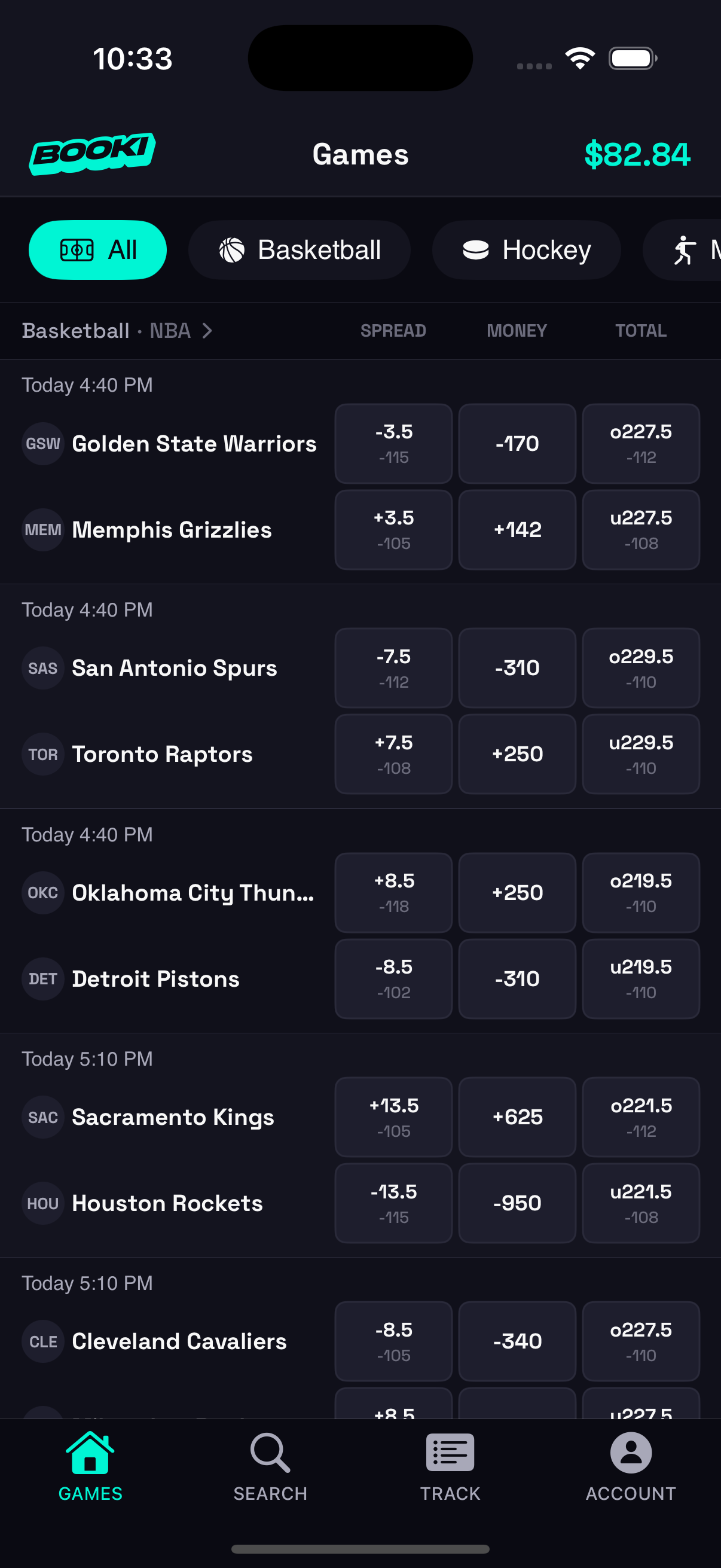
Organizer: 5-Tab Structure
| Tab | Purpose | Key Pattern |
|---|---|---|
| Dashboard | PnL trends, risk watchlist, exposure metrics | Time-selector filters headline number |
| Picks | All bets with status/type/member filters | Card-based detail view |
| Members | Roster with attention tags and capacity | Inline search + 6 smart filter chips |
| Events | Sport categories as cards, league sub-tabs | Shared events architecture |
| Settings | Profile, subscription, pick management | Menu page with detail views |
Member: 4-Tab Structure
| Tab | Purpose | Key Pattern |
|---|---|---|
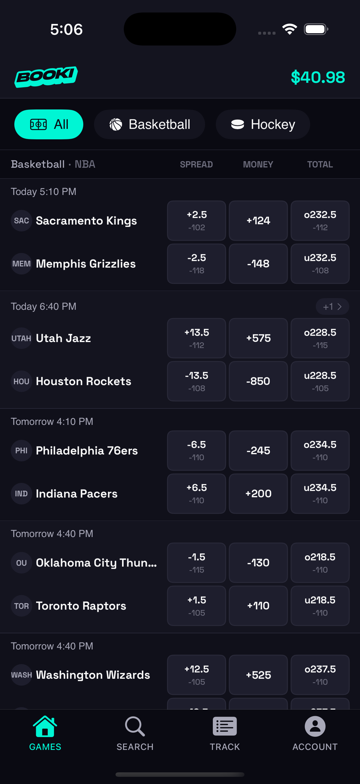
| Games | Browse events with sport tabs | Horizontal sport scroller, compact cards |
| Search | Full-text team search by sport/league | Dedicated tab for discoverability |
| Track | Bet history with ticket grouping | Open/graded toggle, scores inline |
| Account | Balance, activity, profile, preferences | Card-based layout with stats |
The asymmetry is intentional. Organizers need more surface area (5 tabs) because their tasks are more varied. Members need speed (4 tabs) because their primary action is singular: find a game, place a pick.
Platform Parity: iOS + Web
The web dashboard provides feature parity for organizers who prefer desktop. Key differences are intentional, not compromises:
- Bet slip: Fixed sidebar on desktop (340px), floating sheet on mobile, each native to its input paradigm.
- Member detail: Inline grid editing on web, modal sheets on iOS.
- Navigation: Hash-based routing with responsive sidebar (collapses to hamburger on mobile).
Both clients share the same backend, Edge Functions, and real-time subscriptions. Data changes on one platform appear on the other within seconds.
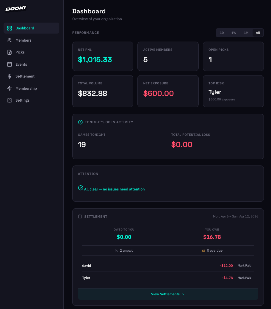
Organizer Web Dashboard
Marketing & Growth
Landing Site
8-section homepage with scroll-reveal animations, dedicated features page with mixed layouts, and a comparison section that positions Booki against traditional PPH pricing.
SEO & Content
- Structured data (JSON-LD), Open Graph tags, and sitemap on all pages.
- 3 bottom-funnel SEO landing pages targeting search intent ("PPH alternative," "bookie software," "ledger software").
- Blog with 8+ articles, staggered publish dates, FAQPage schema on comparison posts.
Web-First Pivot
Originally positioned as an iOS app with a web companion. I pivoted to web-first messaging, replacing App Store CTAs with "Get Started Free" links to the web dashboard. This removed the friction of requiring a download before experiencing the product.
Navigating Technical Complexity as a Designer
This section isn't about showing off code; it's about demonstrating that I understand the systems I'm designing for, and that my design decisions account for real engineering constraints.
- 26 Edge Functions handling everything from bet submission to Stripe webhooks to Apple IAP verification. Each function enforces its own authorization, idempotency, and audit logging.
- 27 database migrations evolving the schema from a simple bet tracker to a multi-tenant platform with hash-chain ledger integrity, atomic settlement transactions, and row-level security policies.
- Smart API budgeting — the live scores system estimates game durations by sport and only polls the Odds API when games are in their finishing window. (Answer: 5 minutes during the last 30 minutes of a game.)
- Offline-first architecture — local storage for everything, cloud sync when online. The app feels instant, and I designed loading states around sync completion rather than network latency.
Interactive Prototype
Tap through the app below
Outcomes & Reflection
What I'd Do Differently
- Start with the web dashboard, not iOS. The web-first pivot was the right call, but I'd have reached it faster by shipping the web experience first and treating native as the upgrade.
- Research App Store restrictions earlier. I was excited to build a native iOS app, and my initial research suggested it was possible. But Apple recently tightened restrictions on solo developers publishing gambling-adjacent apps, which put most of the iOS work on hold. A deeper dive into App Store policy before committing to native would have saved significant time and reframed the project scope sooner.
- Validate before building. I was excited to build something I thought my friends and I would use, but the target user turned out to be a tight niche. I spent too much time on features and not enough getting the product into real hands early. A leaner MVP and earlier distribution thinking would have surfaced that sooner. The process was a valuable learning experience, but next time I'd prioritize user validation over feature depth.
What This Demonstrates
- End-to-end product ownership — from market insight to information architecture to pixel-level UI to production backend to marketing site.
- Product-minded design — every design decision tied to a business thesis (trust, pricing as positioning, compliance as UX win).
- Systems thinking — designing across iOS, web, and server-side with consistent mental models and intentional platform divergence.
- Technical fluency — not just "familiar with code" but shipping production systems with real architectural tradeoffs.
- Constraint-driven creativity — App Store compliance language becoming a friendlier product voice; API rate limits becoming smart polling; pricing model becoming brand positioning.

